Preface
It is fairly routine for end user software (stand alone or web based) to come with dash boarding functionality. The vast majority of these follow a tried and tested formula, namely you layout a number of widgets in a grid (with varying degrees of flexibility). The widgets are populated by some query into the underlying system, and the user chooses a suitable display mechanism for the data that is returned (I.E. charts, tables, heat maps and so on). Depending on the software you may be able to tailor the aesthetics of the widgets, but as a rule the general theme is defined by the software itself. If you were to Google for dashboards you would be bombarded with examples.
The main advantages of this method (and probably why it is so prevalent in dashboard deployment) is that it is quick and easy for the end user to deploy content, and the limited configuration options mean that the user does not need any significant dashboard skills of their own (most of the design is done by the underlying application).
Geneos dashboards however provide a different model, allowing the user to design and build a dashboard from the ground up as you might do in Visio, PowerPoint, or a graphics application such as photo shop or Paint Shop Pro. This provides the user with considerable flexibility in the content and look and feel of the final dashboard, but also places a heavy focus on the users own dashboard and design skills. They can essentially create almost any design they can conceive, you thus end up with a bit of paradox
The best thing about Geneos dashboards is their flexibility, while the worst thing about Geneos dashboards is their flexibility
This article therefore attempts to provide some general guidelines and examples of what constitutes good dashboard design, and hopefully removes some of the barriers that stop users building effective dashboards.
Why have a dashboard?
A dashboard is a method of alerting that brings an issue immediately to your attention. A well designed dashboard allows a user to perform his tasks safe in the knowledge that any issue that requires action is brought to the user's attention.
Without a dashboard the user might be relying on email alerts or Active Console to be notified of issues.
This often requires the user to time-slice between his routine work and performing system checks, which is expensive for the user and is usually far less responsive.
What makes a good dashboard?
|
"A Dashboard is a visual display of the most important information needed to achieve one or more objectives; consolidated and arranged on a single screen so the information can be monitored at a glance" "It is a product of design which should aspire for simplicity over dazzle" |
If we further distill this to focus on the heart of effective dashboard design:
Most Important information, displayed on a single screen in the simplest way possible.
When not to build a dashboard
There are a few, rare, occasions when the time spent creating a dashboard is not worth the investment. Usually however, this is not the case.
- It should be better than the alternative. It should be a more effective alerting and information system than the other systems that are available. Within Geneos there are lots of ways you can be alerted, which are discussed at length on this page. If the audience already has an effective system which is essentially better than the proposed dashboard (and its placement) then don't bother.
- Replicating data from another view. A common starting dashboard is a simple port of a metric view onto a dashboard. While you can change the aesthetic of the view via the migration the dashboard is poor proxy for a sort-able, filterable, fast updating metric view.
Building a culture of zero tolerance
A good dashboard can be an unintended but highly desirable state of building a culture of zero tolerance to particular events and on-going situations.
The fundamentals of good dashboard design
There are a few fundamental design principles that should be applied to any dashboard design
- Known Audience
- Simple, Abbreviated, Summary, Succinct
- Attention, Action
- Context
- Data, not ornamentation
- By Exception
Know your audience
A golden rule of dashboard design is to have spoken to your audience before you even begin, preferably face to face. Good dashboard design is an iterative process, so you will likely present a series of designs to the audience as you go honing and improving the design, such that once deployed its is not a surprise. During the opening discussions you should get a sense for:
- What information they need, when do they need it, and when will they be finished with it (I.E. have solved the problem)
- What granularity of information do they need to know they need to do something, note this differs from having all the information they need (to know specifically what they need to do (which we talk about later)
- How many alert conditions will in general appear?
- How long will the alerts persist?
Simple, Abbreviated, Summary, Succinct
A good dashboard minimizes the information it presents, its aim is to alert that action is required, not how to react.
|
"Information on a dashboard is abbreviated in the form of summaries or Exceptions" "A Dashboard must be able to quickly point out something that deserves your attention and might require action" "Eloquence through simplicity" |
For every item you add to the dashboard consider the following:
- Is the audience going to react to this within a suitable time scale?
It is also important to try and get what you what to alert on into a single screen. If you are trying to condense a large Geneos real estate into a single screen this may seem daunting, but remember Know and plan for your audience and report by exception. A dashboard will be aimed at a particular group of people you will have a finite capacity to absorb and act on information, forcing yourself to compress this into one screen will help you focus on what really matters. As a dashboard design matures you may consider a one item on, one item off strategy, removing content which team members have stopped looking at, or are ignoring.
Attention, Action
A good alerting dashboard should make it very clear when there is something to do.
|
"An Analytical dashboard, as a monitoring device, tells the Analyst what to investigate, not how" "Forcing yourself onto one screen makes you consider what?s important and how succinctly can I portray it?" |
Methods of attracting attention:
- Color: The most obvious method of attracting attention is color. Care should be taken to avoid bold color when there are no alerts.
- Size and scale, unlike in the remainder of the console where all icons are essentially of the same size in the dashboard you can make some elements larger and bolder than others
Context
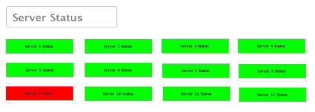
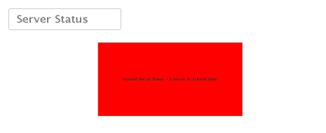
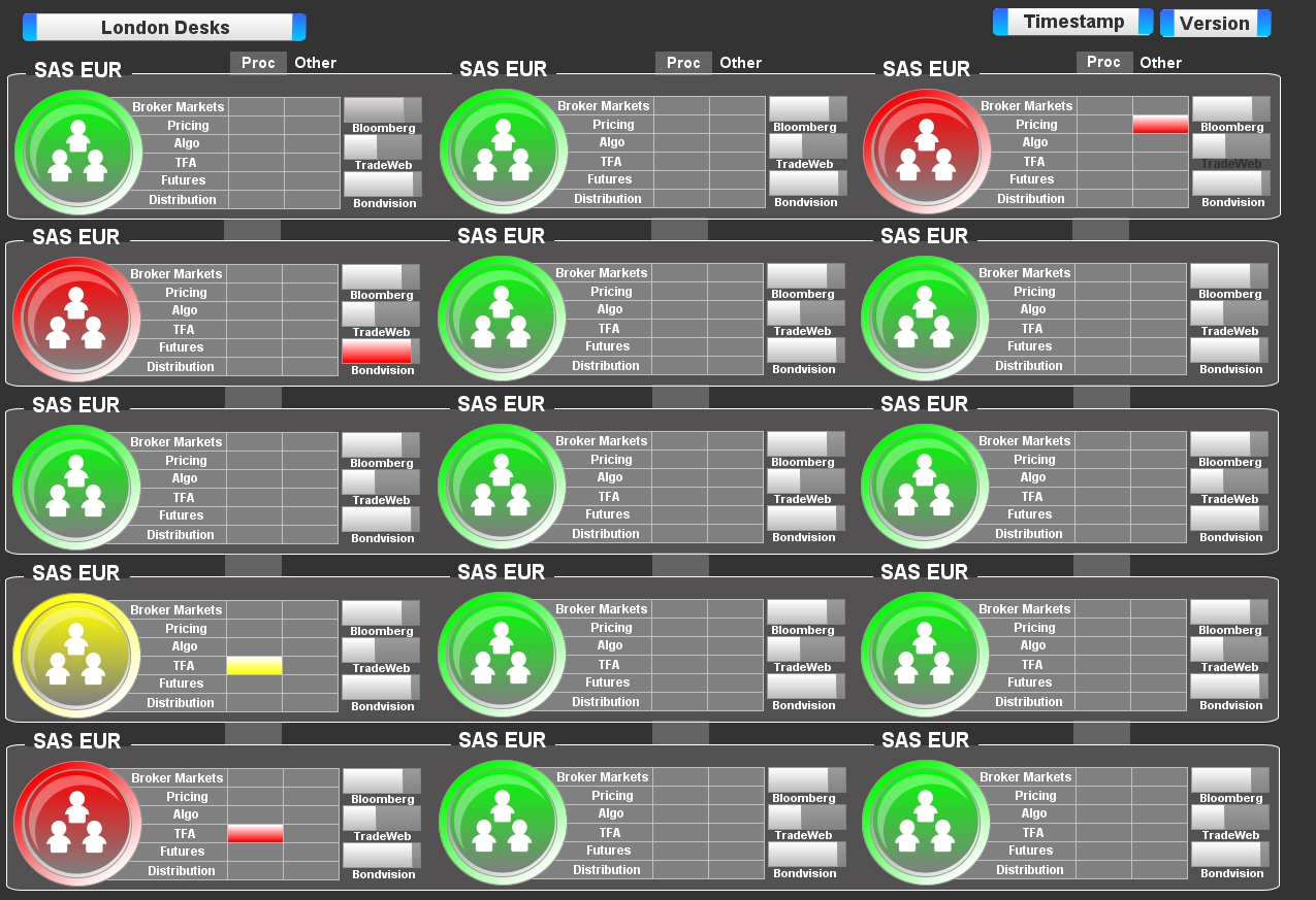
A good dashboard contains the information relevant to the user, and not surplus information. The reason for the dashboard needs to be understood, for example a user should take action if a server is in critical state however that does not mean the user needs to see the status of all the servers. Ensuring that data that is not relevant to the user is abstracted from the view is important, to the extent that the dashboard should show the information that is required in the most efficient way possible (not requiring the user to have to process the information they see). For example, a server farm of twelve servers does not need a status box for each server; instead a single status box called "Server Status" can alert the user to a critical server event that requires action. If a single server is critical then action is required by the support agent.
In the first screenshot the user has to process the information he sees, and should decide whether one server out of 12 being critical requires action.
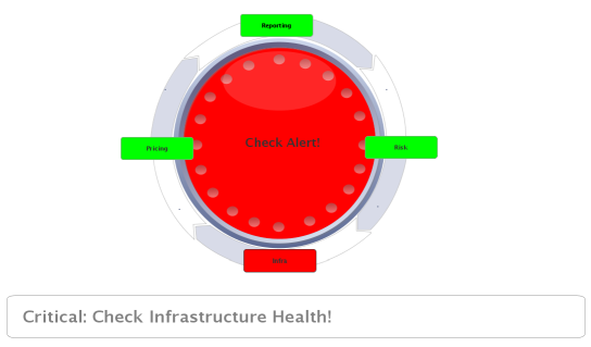
In the second screenshot a lot less space is being used to show the server status. However the alert is clear and action is required.
Data not ornamentation
The purpose of most dashboards is to convey data and information. Therefore the most important content on the dashboard is the information itself. Out of necessity however there will be other constructs on the dashboard which aid in its layout and design. A common mistake is for that additional ornamentation is to more focal than the data itself. Take the examples below:
|
Application Monitoring |
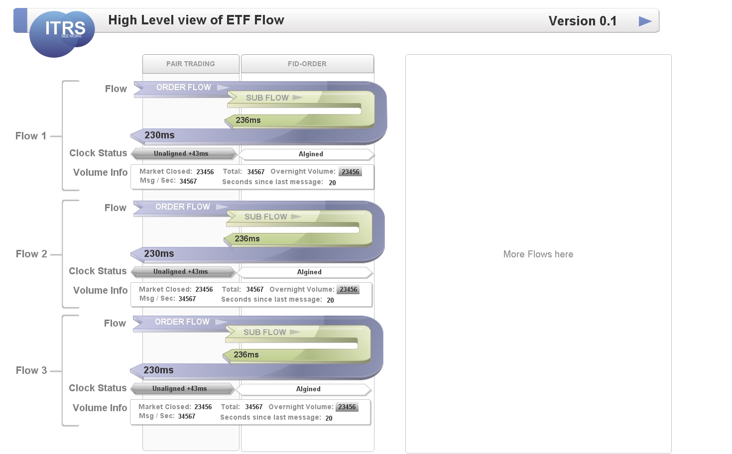
High level flow dashboard |
|---|
Application Monitoring dashboard
This dashboard contains plenty of information is a series of columns, however the tables themselves have a light background vs the darker dashboard and light borders which means even when there are no alerts they are prevalent. The small volume bars are also light in color even when not altering which means they remain a distraction. The green circular icons for the main health indicators are almost stronger than the red alerts. All this means that alerts seem to be no more focal that the constructs of the dashboard.
High level flow dashboard
There is a data on this dashboard, but you have to look hard for it. The bulk of the focus is taken by the curved arrows, that convey just two bits of data of round trip latency. The arrows, clock status fields and flow bracket labels take most if the focus, de-focusing the information. In fact 90% of this design is ornamentation, such that once the user has looked at it for a while will be irrelevant.
An example with less ornamentation
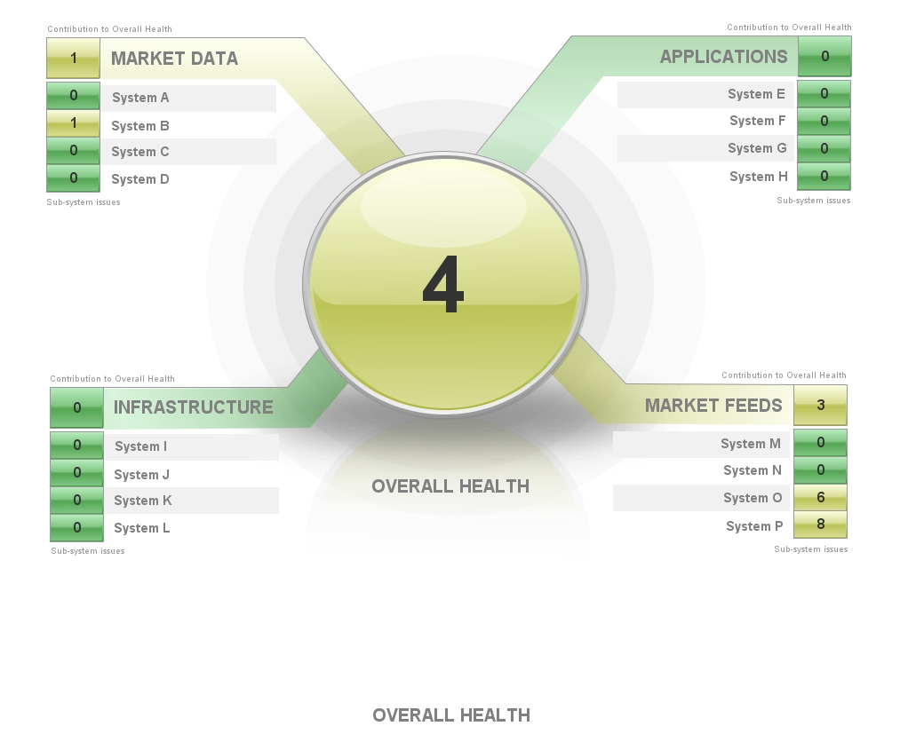
The example below was one of our early TREP/RTDS template examples. The focus is on alerts which as you will note make the center of attention, with reduced ornamentation (though I am sure you will see how we could reduce this further). The lines, borders and labels all contribute to the alert stats, so there is little in the way of ornamentation that does not directly contribute to the conveying of information. There is quite a lot of white space though, we may have been better utilized.
Common Mistakes
Alerts which never clear
Users very quickly become accustomed to the status of alerts. It is important users invest to ensure their alerts are not perpetually in a critical state. Often, a dashboard will highlight this problem.
A widget which shows the number of alerts is a common mechanic on many dashboards. It may sound obvious, but if a dashboard item is likely to be in a perpetual alert state then it will soon become irreverent on the dash board. A common instance of this are alert counts, for example take the following:

A widget which shows the number of alerts is a common mechanic on many dashboards.
For example having a count (and associated severity) of net probes that are down in your Geneos real estate seems on the face of it to be a useful dashboard function. However if you have a large number of net probes that is a chance at any given one or more maybe down for planned or unplanned reasons. If this indicator always displays 1 or more and as yellow the users will quickly become desensitized to the alert and ignore it. For this alert to work it needs to spend most of time as 0 and OK, users will then respond when there is an event.
Where such a number is always more than 1 you may also miss an event where 1 alert clears and a new one comes up, leading to potential missed alerts or actionable situations.
How to fix this:
- Think about how the user current responds to that alert and implement that logic in Geneos. For example, if the user expects the alert to clear after ten minutes then add this logic to the rule block ("delay 600"). If the user
- Before making the metric live get the alert count to 0, you need to then move forward with a culture of reacting to that alert when its non-zero.
- Remove the alert or change the rule. If an alert is not being actioned then consider downgrading or removing it.
Using severity colors for non severity reasons
While in general dashboard design (outside of Geneos) you are free to use whatever colour scheme you choose, when building alerting dashboards you should be a bit more selective. Specifically you should avoid RAG Red, Amber and Green) colors when they are not being used to represent severity. The most obvious mistake is to use RAG colors for constructive elements of the dashboard design, see the example below:

However a more common (and less obvious) mistake is to show perpetual RAG colour on the dashboard with a count (or similar) of those events, which may be 0. In this case while the design seems sensible it may leave Amber or red elements on the dashboards even when there are no issues.
The recommended approach is to have a clean dashboard with no colour causing distraction to the user. The prime purpose of the dashboard is to alert the user of issues, which translates to red to show the user needs to take action but does the user need to see green to be confident the system is working? A single box showing OK turning to red to show Critical is the most effective approach:

Overuse (or any use really) of gauges
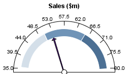
Gauges have long been a popular method of communicating information, but what benefit do they provide? The example below showing Sales shows that Sales is around $53m yet the gauge tells us nothing else. Is the sales level good? What does the gauge scale represent? A gauge uses a lot of real estate of the dashboard yet does not represent data in a useful way.
Types of dashboards
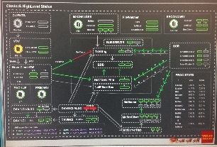
Informational - Explains the flow or process like a Visio diagram whilst representing the configured monitoring of the application
Most documentation for applications includes a flow diagram to explain to the user how the application functions. What if you can take that flow diagram and add data that is available in Geneos? Whilst you now display live data and health status the dashboard by its nature is not designed for alerting. The downside here is the importance of a critical alert may lose significance if the flow diagram doesn't allow it enough prominence.
Alerting - Alerts the user that action is required
An alerting dashboard is designed to bring issues to the users attention. The center of the dashboard is the focus of the user and this real estate should be used to highlight issues:
Information AND Alerting! - A mix of both!
What if the user wants only one dashboard? In this case the user needs to be creative. The center of the dashboard should be used for alerting, the remaining real estate to provide information.
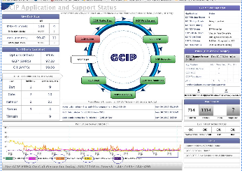
Alternatively a user could choose to create an Alerting dashboard to highlight issues, with informational dashboards to allow the user to drill down to understand the issue.
Starting with a Blank Dashboard - The challenge of the blank canvass
One of the most common challenges we hear about when starting a new dashboard is the imposing presence of a black dashboard. Presented with the blank sheet version 1.0 of your dashboard can seem a long way of.
Before starting on your dashboard, spend time designing it on a sheet of paper first!
Think about the following before you open Active Dashboard Manager
- What type of dashboard you are creating (informational or alerting or a mix of both)
- Who is the audience and what information do they need to be informed of. Don't ask users what they want the dashboard to look like, rather ask them what they need FROM the dashboard and then tailor it to their needs using the design advice given here. For example users may expect fancy gauges and graphics but when you ask them what they need they will probably want to be alerted of any critical issue and will want some key statistics from their system.
- Plan well in advance so you don't have last minute additional items to squeeze in at the end.
- If using tables, make sure you get the number of columns right at the start!
- Use an existing dashboard and tailor it to your requirements!
- Keep asking yourself, is there a better to provide the same information but in a cleaner format?
You are moving their world to a better place - there must be a reason why the dashboard should exist, and it should add value to the audience. I.E. by telling them something they do not know, by bringing information into one place.
Design Approach
Limit the amount of data shown
Too many metrics and your dashboard will look confusing. Keep the important metrics on display only.
Use colour sparingly
The dashboard will look confusing if you have too much colour. Use colour to bring issues to the user's attention, if colour is already there then the dashboard can become less effective.
Arrange data based on priority
The human eye picks the top left corner of the dashboard first which gives this area significance. The center of the dashboard is also prime real-estate to display to the user.
Ensure items requiring Action by the user are correctly visualized
If your dashboard is to alert the user requiring action, ensure you design the dashboard in a way that brings this to the user's attention. I.e. have a clear dashboard with little colour when no alert is present, and make the dashboard light up to bring issues to the user's attention when an alert is active.
https://www.geckoboard.com/blog/4-essential-steps-to-designing-a-dashboard-that-inspires-action
References
https://www.amazon.co.uk/SHOW-ME-NUMBERS-STEPHEN-FEW/dp/0970601972/ref=asap_bc?ie=UTF8
Common Pitfalls in Dashboard Design, by Stephen Few 2006 -
Comments
0 comments
Please sign in to leave a comment.